Nura

Project overview
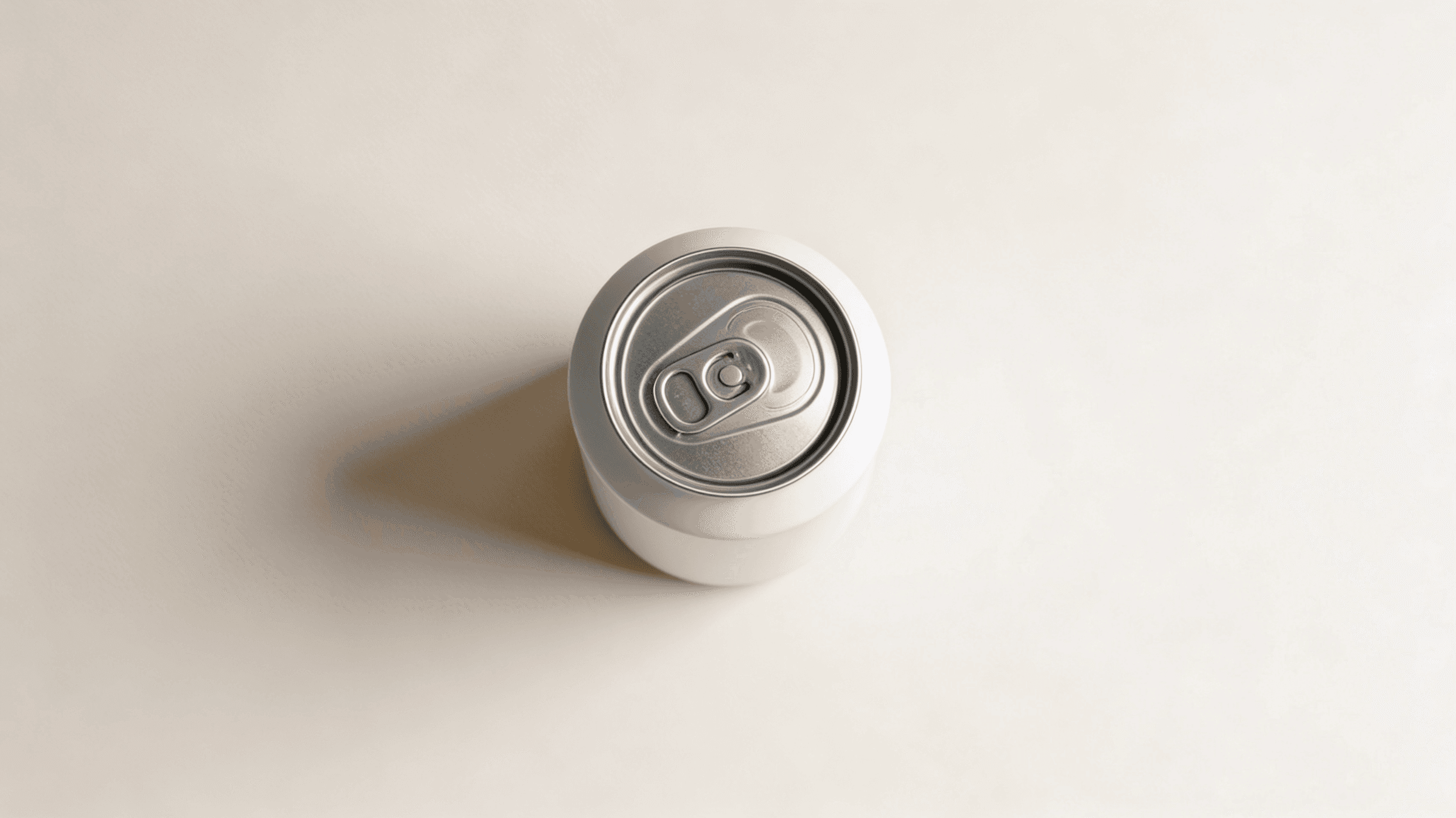
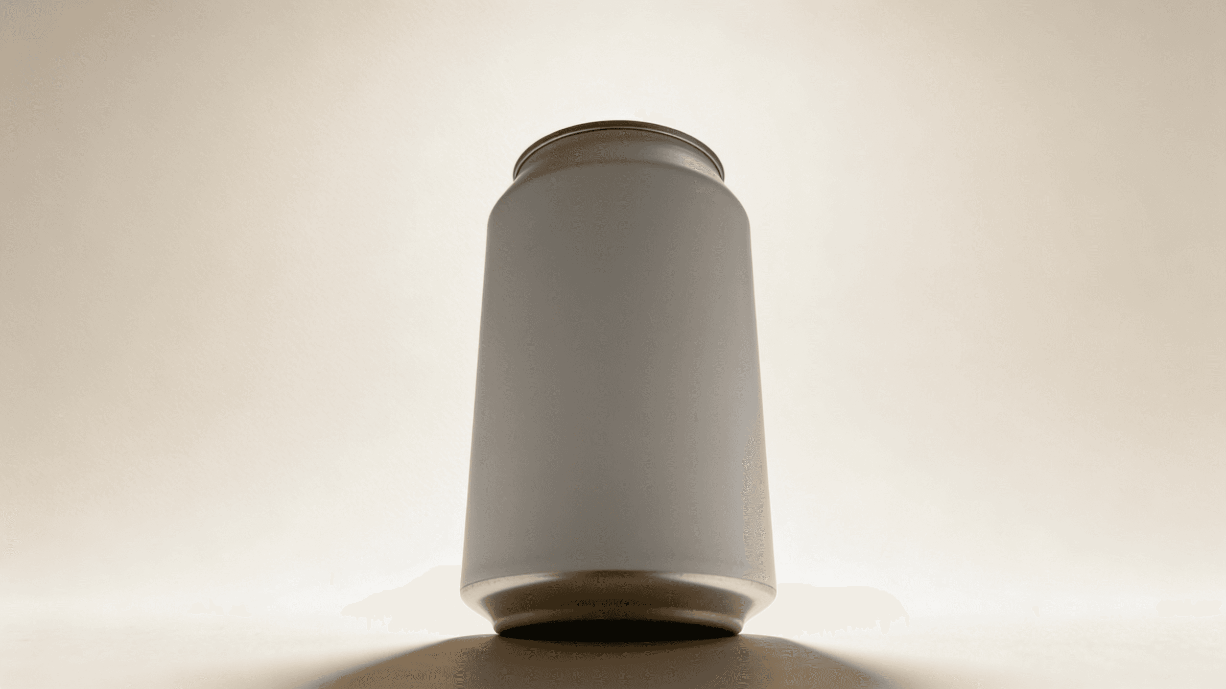
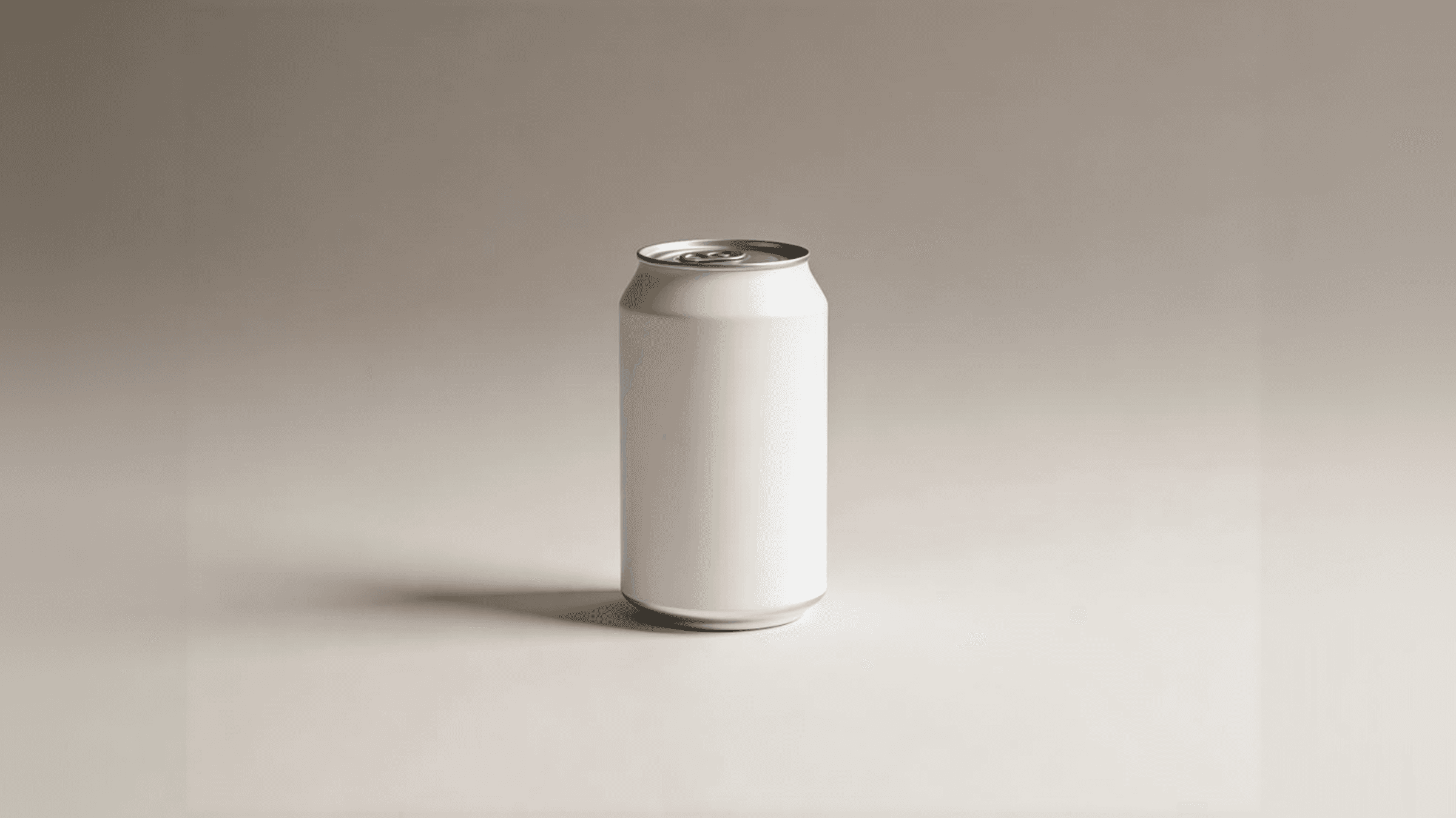
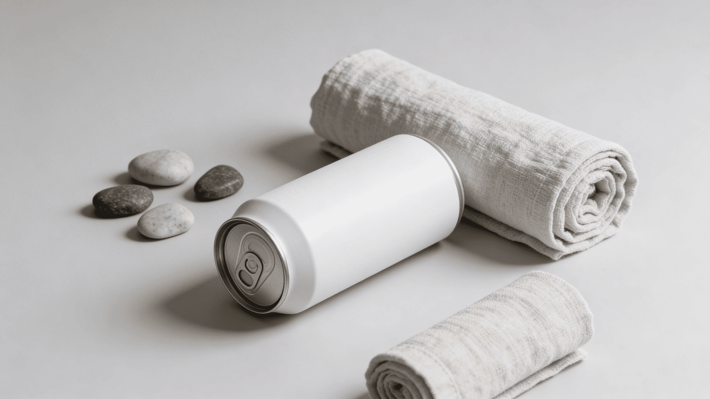
I designed a disruptive packaging concept for Nura, an ultra-premium canned water brand that advocates for radical transparency and environmental consciousness. The project moves away from traditional beverage marketing to embrace a "non-branded" aesthetic. By using a 100% matte white aluminum finish, the packaging serves as a tactile representation of water’s purity, creating a silent but powerful presence in a noisy retail environment.
Services
Packaging
Client
Nura
Industry
Consumer Packaged Goods
Year
2025

Challenge
The main challenge was to justify the complete absence of visual graphics in a market driven by bold logos and vibrant colors. We needed to communicate that the lack of ink wasn't an oversight, but a deliberate environmental and aesthetic choice. The design had to feel like a premium object of art rather than a generic commodity, relying solely on form, texture, and the play of light on the matte surface to convey quality.
Outcome
The result is a groundbreaking packaging system that prioritizes the planet over promotion. By eliminating 99% of traditional printing inks, we significantly reduced the chemical footprint of the production process. The "Ghost Can" became a viral aesthetic statement, attracting a demographic that values minimalism and sustainability. Nura successfully positioned itself not just as a water brand, but as a lifestyle icon that proves that, sometimes, the strongest brand message is silence.
View more work.


